
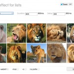
Il codice seguente consente di creare uno slider di immagini con miniature ed effetto fade utilizzando soltanto le proprietà di CSS3. Il codice è molto semplice da usare e scalabile per ospitare qualsiasi numero di immagini senza alcun problema. Sia lo slider, gli effetti fade per le transizioni e le miniature sono ottenute senza il minimo ausilio di script, bensì con solo e puro codice CSS3. Guarda la demo per vedere lo slider in azione! Buon lavoro!
Codice HTML
|
1 2 3 4 5 6 7 8 9 10 11 12 13 14 15 16 17 18 19 20 21 22 23 24 25 26 27 28 29 30 31 32 33 34 35 36 37 38 39 40 41 42 43 |
<!-- We will make a slider with stylized thumbnails using CSS3 The markup is very simple: Radio Inputs Labels with thumbnails to detect click event Main Image --> <div class="slider"> <input type="radio" name="slide_switch" id="id1"/> <label for="id1"> <img src="http://thecodeplayer.com/uploads/media/3yiC6Yq.jpg" width="100"/> </label> <img src="http://thecodeplayer.com/uploads/media/3yiC6Yq.jpg"/> <!--Lets show the second image by default on page load--> <input type="radio" name="slide_switch" id="id2" checked="checked"/> <label for="id2"> <img src="http://thecodeplayer.com/uploads/media/40Ly3VB.jpg" width="100"/> </label> <img src="http://thecodeplayer.com/uploads/media/40Ly3VB.jpg"/> <input type="radio" name="slide_switch" id="id3"/> <label for="id3"> <img src="http://thecodeplayer.com/uploads/media/00kih8g.jpg" width="100"/> </label> <img src="http://thecodeplayer.com/uploads/media/00kih8g.jpg"/> <input type="radio" name="slide_switch" id="id4"/> <label for="id4"> <img src="http://thecodeplayer.com/uploads/media/2rT2vdx.jpg" width="100"/> </label> <img src="http://thecodeplayer.com/uploads/media/2rT2vdx.jpg"/> <input type="radio" name="slide_switch" id="id5"/> <label for="id5"> <img src="http://thecodeplayer.com/uploads/media/8k3N3EL.jpg" width="100"/> </label> <img src="http://thecodeplayer.com/uploads/media/8k3N3EL.jpg"/> </div> <!-- We will use PrefixFree - a script that takes care of CSS3 vendor prefixes You can download it from http://leaverou.github.com/prefixfree/ --> <script src="http://thecodeplayer.com/uploads/js/prefixfree.js" type="text/javascript"></script> |
Codice CSS
|
1 2 3 4 5 6 7 8 9 10 11 12 13 14 15 16 17 18 19 20 21 22 23 24 25 26 27 28 29 30 31 32 33 34 35 36 37 38 39 40 41 42 43 44 45 46 47 48 49 50 51 52 53 54 55 56 57 58 59 60 61 62 63 64 65 66 |
/*Time for the CSS*/ * {margin: 0; padding: 0;} body {background: #ccc;} .slider{ width: 640px; /*Same as width of the large image*/ position: relative; /*Instead of height we will use padding*/ padding-top: 320px; /*That helps bring the labels down*/ margin: 100px auto; /*Lets add a shadow*/ box-shadow: 0 10px 20px -5px rgba(0, 0, 0, 0.75); } /*Last thing remaining is to add transitions*/ .slider>img{ position: absolute; left: 0; top: 0; transition: all 0.5s; } .slider input[name='slide_switch'] { display: none; } .slider label { /*Lets add some spacing for the thumbnails*/ margin: 18px 0 0 18px; border: 3px solid #999; float: left; cursor: pointer; transition: all 0.5s; /*Default style = low opacity*/ opacity: 0.6; } .slider label img{ display: block; } /*Time to add the click effects*/ .slider input[name='slide_switch']:checked+label { border-color: #666; opacity: 1; } /*Clicking any thumbnail now should change its opacity(style)*/ /*Time to work on the main images*/ .slider input[name='slide_switch'] ~ img { opacity: 0; transform: scale(1.1); } /*That hides all main images at a 110% size On click the images will be displayed at normal size to complete the effect */ .slider input[name='slide_switch']:checked+label+img { opacity: 1; transform: scale(1); } /*Clicking on any thumbnail now should activate the image related to it*/ /*We are done :)*/ |
pixolo ads


 | Articolo pubblicato 5 anni fa nella categoria


